


The Guardian app navigation (iOS & Android)
Long-running project to improve navigation patterns for the Guardian app's users.
The app navigation was growing increasingly misadjusted to contemporary app uses. In response, we prototyped and researched many navigation solutions aimed at for regular readers, while also supporting better access to premium features.
Working method
Design lead in the apps team.The apps design team ranged from a sole designer (myself) to 5 designers in different periods
Working in close collaboration with product managers, using scrum methodologoies with three engineering teams: backend, Android and iOS
This is a public preview page. Contact me for access.
If I sent you special link, use it to access to the complete case-study.
The starting point
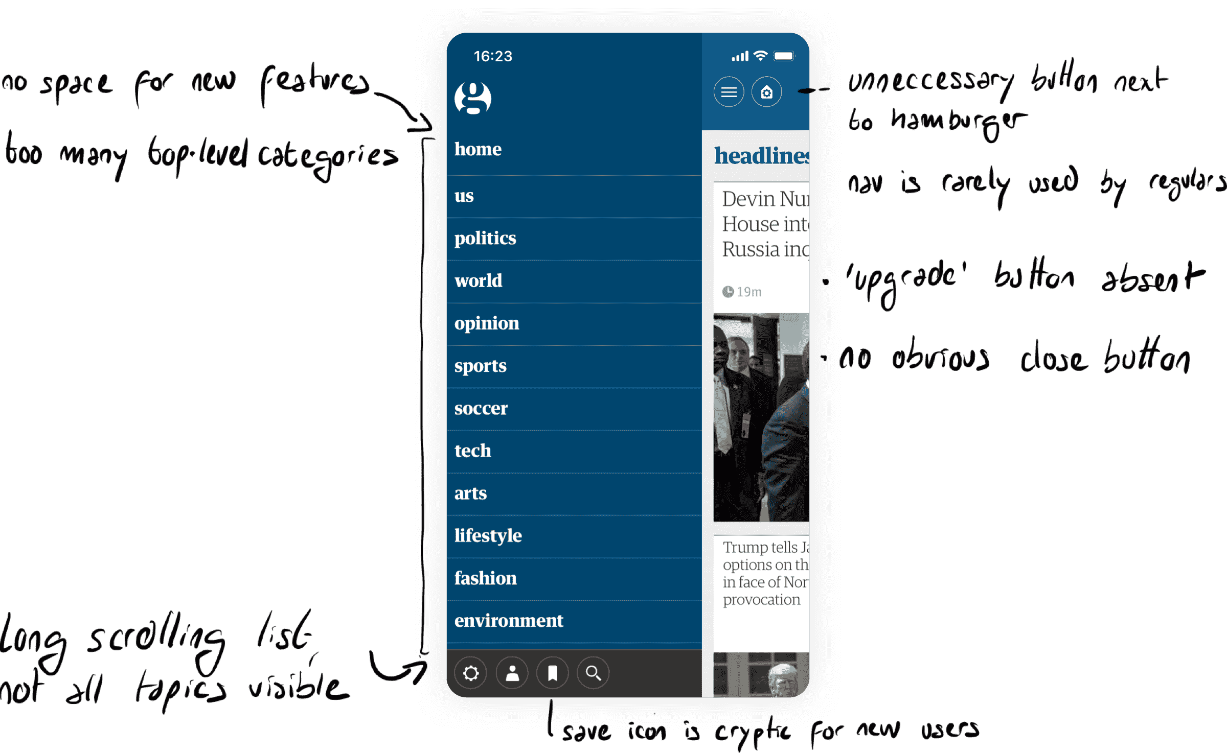
Our nav had overwhelming issues we were looking to solve with users in mind
150k new users per month
10×more likely to read daily
25% longer time on articles
App users are the most engaged in content overall, according to our data
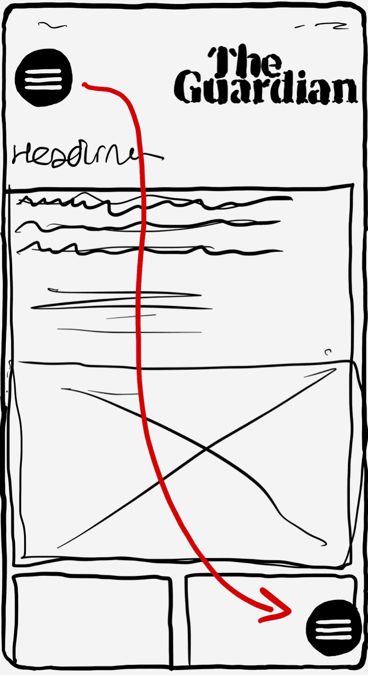
Moving the hamburger
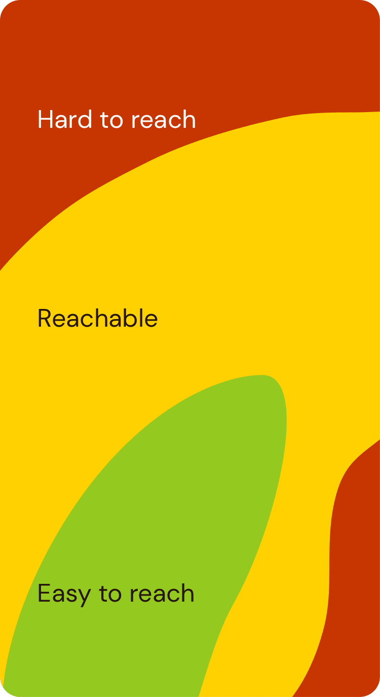
Our first step was chosen to be a quick win and easy to implement: moving the hamburger button to makes the app easier to use on one hand; because scrolling is a very common action in the app, we keep the button out of the green zone, which avoids accidental taps.

“I expected [the G icon] to contain Guardian news… you’d get used to it really quickly”
Annabelle, regular reader on The Guardian’s app
“Where’s the navigation?”
Gabriel, not a regular Guardian reader
“It feels failry instinctive”
Rachel, regular reader on the Guardian’s website
"I'm more used to top left or top right, but this works quite well; especially on a phone this size — maybe there's more thumb travel on a larger phone?"
Murad, sporadic reader on The Guardian’s app
Speed-dial prototype
As a result of ideation workshops, we developed and user-testes this navigation concept. We opted for guerilla research in the Kings Cross area in London, where we met a viriety of regular and non-regular users


In parallel, we made a push to improve the premium tier in the app. After running a workshop series with internal stakeholders, we opted to develop two new content consumption modes: Discover, a magazine-like section for longer features and photo-essays, and Live, a fast news feed with focus on immediate reporting.

"This is more inviting, it makes me want to spend more time with it. It brings in a younger generation [and] they will buy the guardian in the future"
User testing this prototype
“I can [navigate] on one hand because it’s all on the same side”
User testing this prototype
“The sections stand out more. Splash of colour behind them. I am intrigued”
User testing this prototype
As part of this work, we iterated on the the ‘Speed Dial’ navigation concept and took it through more extensive testing in the user-research lab


"This looks more like a newspaper visually. It’s a lot more serious looking I dont mind that. The search button is right there at the top. The icons remind me of a playstation so I like it already. It is a lot more serious at the top and then playful at the bottom. I like it"
User testing this prototype


“I have dyspraxia so too many options not chronological is not great”
User testing this prototype


“It would take me more time to get to grips with. I feel like if I touch a tab it would take me into other sub sections”
User testing this prototype
Finally, we designed a series of easy-to-implement navigation options — a safe app-native version, . we developed and user-researched four different concepts. And used an effort-impact chart to help determine future steps.