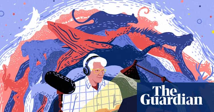
Accessible storytelling: Google • The Guardian • RNIB
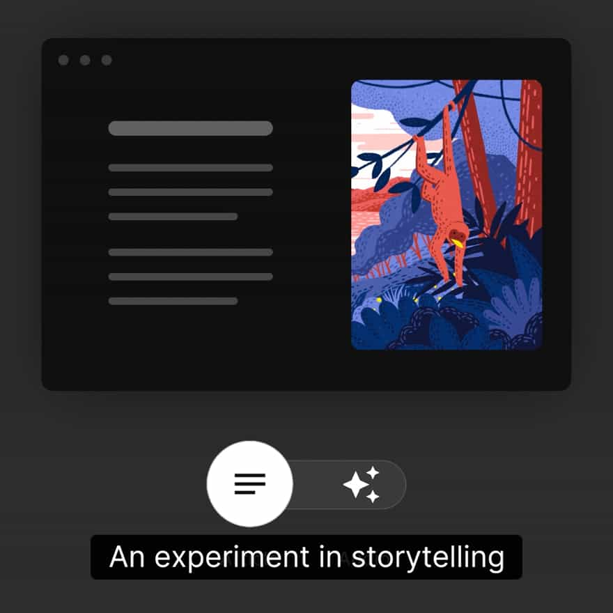
An exercise in adaptive storytelling aimed at blind and low vision users. The project acts as a resource from the partners for accessibility best-practice
Visit this project at auditorial.withgoogle.com
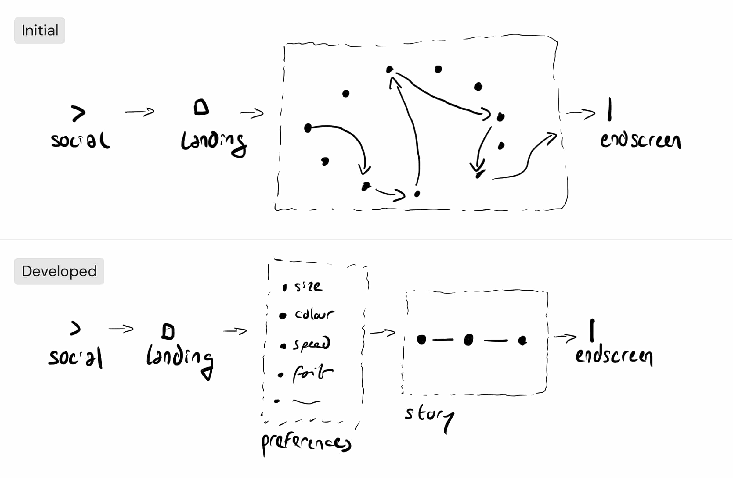
Working method
Design lead at The Guardian, working in close partnership with Google and the RNIB
Spring 2021
This is a public preview page. Contact me for access.
If I sent you special link, use it to access to the complete case-study.
“It’s horrible. A blind person [on a screen reader] is typically met with a barrage of ‘graphic graphic graphic,’ some numbered file name, or gibberish like that from that hyperactive mechanical voice”
Collaborator who is blind
“Screen readers mispronounce things, the cadence is off, they strip all the humanity out of an emotional piece of storytelling”
Collaborator who is blind
“Looking at bright screens gives me headaches. By the end of the day I feel exhausted”
Collaborator with photophobia (light sensitivity)
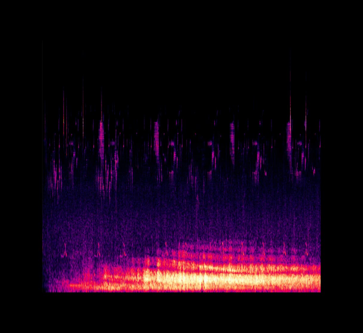
Readers with poor vision use a range of technologies to navigate the web, but these technologies often fundamentally change the experience for the worse. In this project, we tried to offer an excellent experience for users that would often need assistive technology while still providing an excellent experience to those who don't
User flow: playing the story
The project's target audience was at the forefront from the initial thinking around user flows. For example, we deemed the non-linear narrative approach biased towards readers who can visually navigate a map of the story. Instead, we opted to tell the story linearly, allowing a users experience continuously focused on the content, and not on interface and navigation.
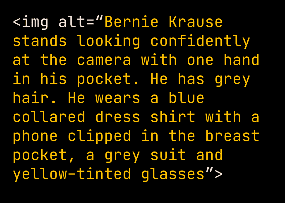
Alt tags are used by screen readers and assistive technologies to describe image content. In this platform, alt tags are considered and written into the flow of the story, rather than as accessory labels
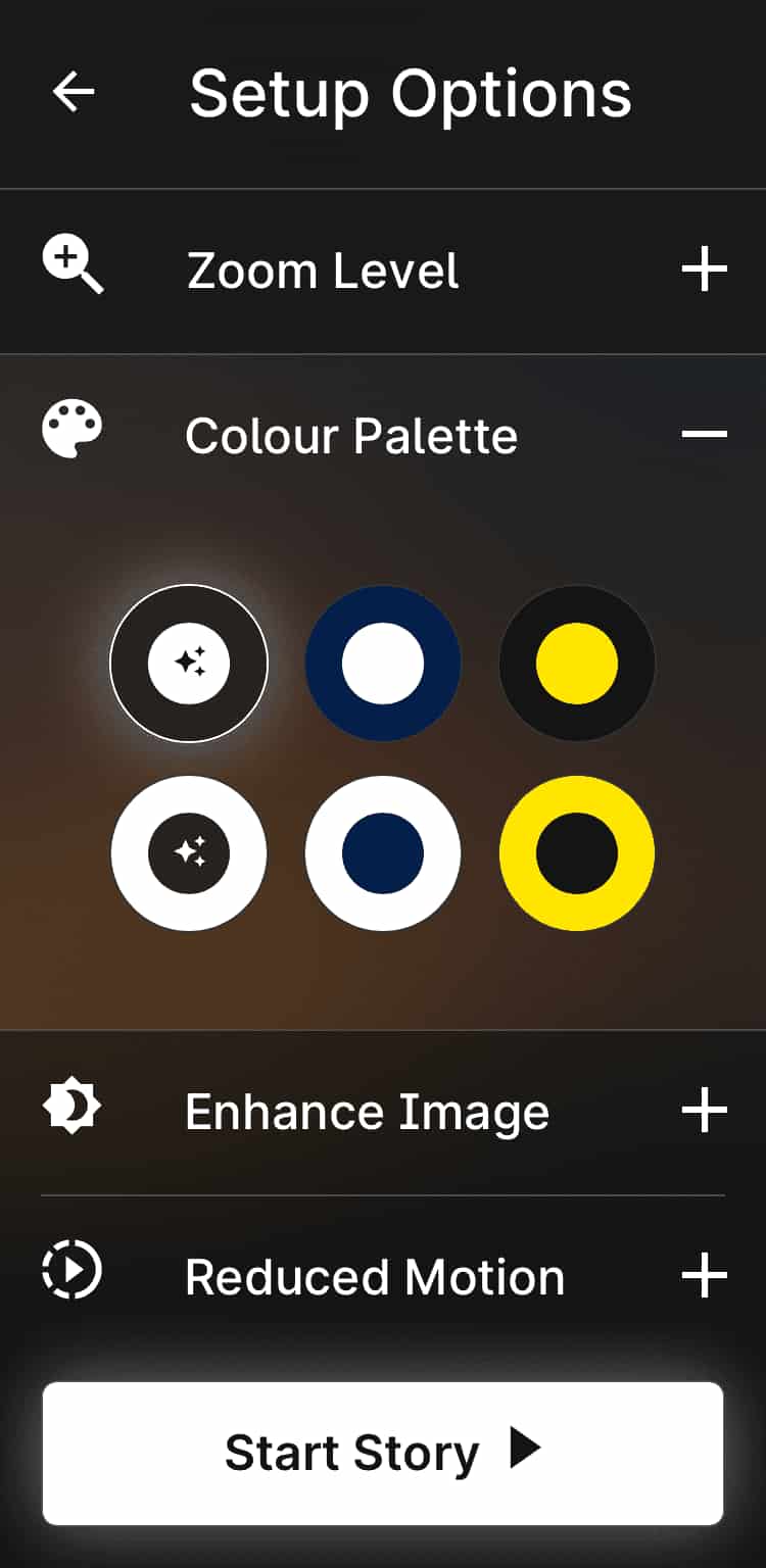
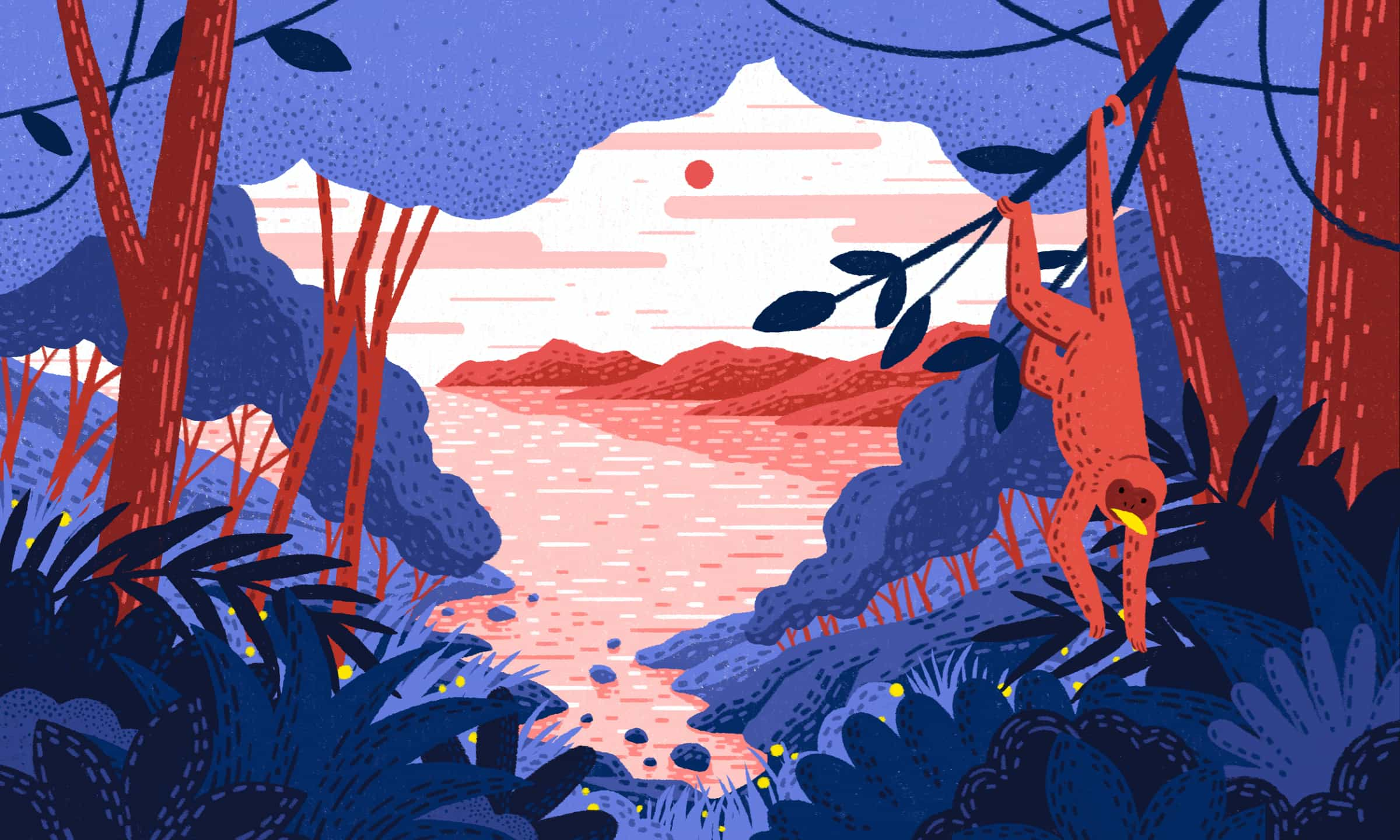
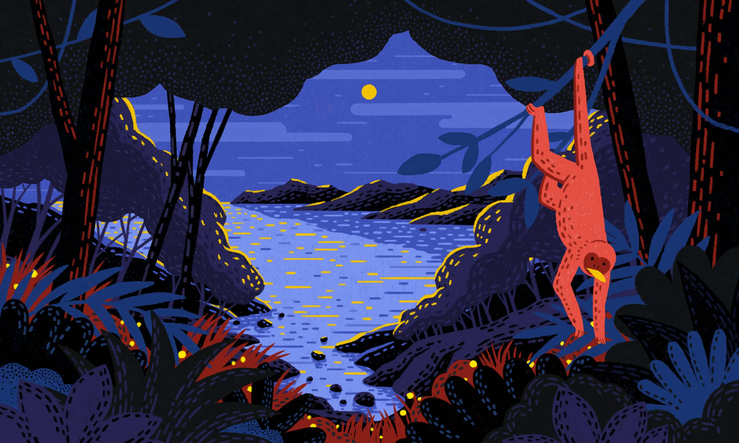
Empowering users with various sight degenerations, six carefully selected colour palettes are available at the story's start. These are thoughtfully selected to meet high contrast requirements at all points and offer the best experience for the different forms of sight loss
“Interview subjects in documentary films are rarely introduced audibly — so you often have no idea who is talking”
Collaborator who is blind

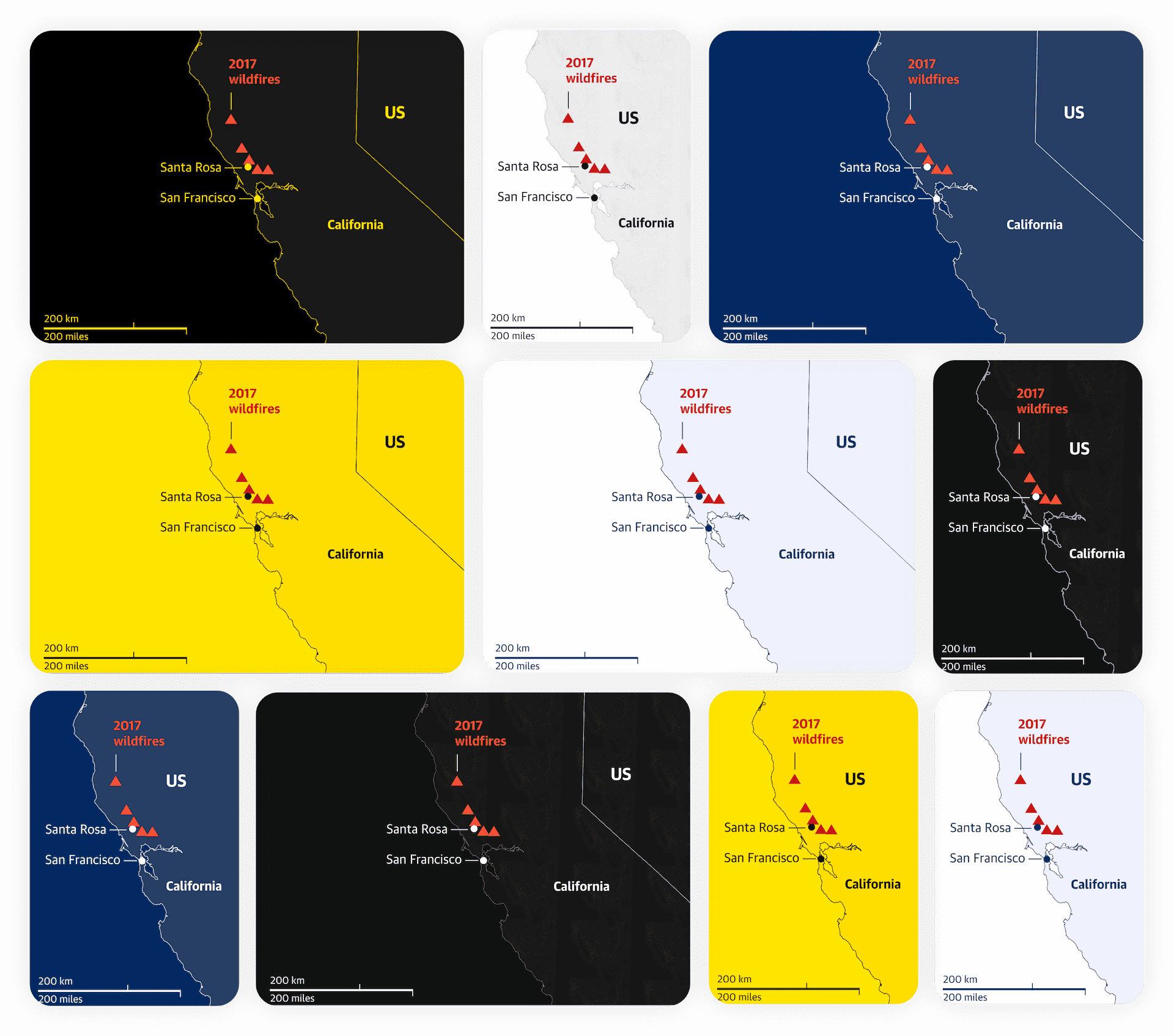
The full range of colour palettes is applied throughout the story.
In these quote screens, designed for first-person narrative moments, the usual order of quote-first and then attribution is reversed. This way, we introduce the person speaking before they address the audience
I art directed and coordinated specialist work in photography, video, mapping and illustration. This enabled the best experience possible for the story, in close coordination with the audio team and the project partners
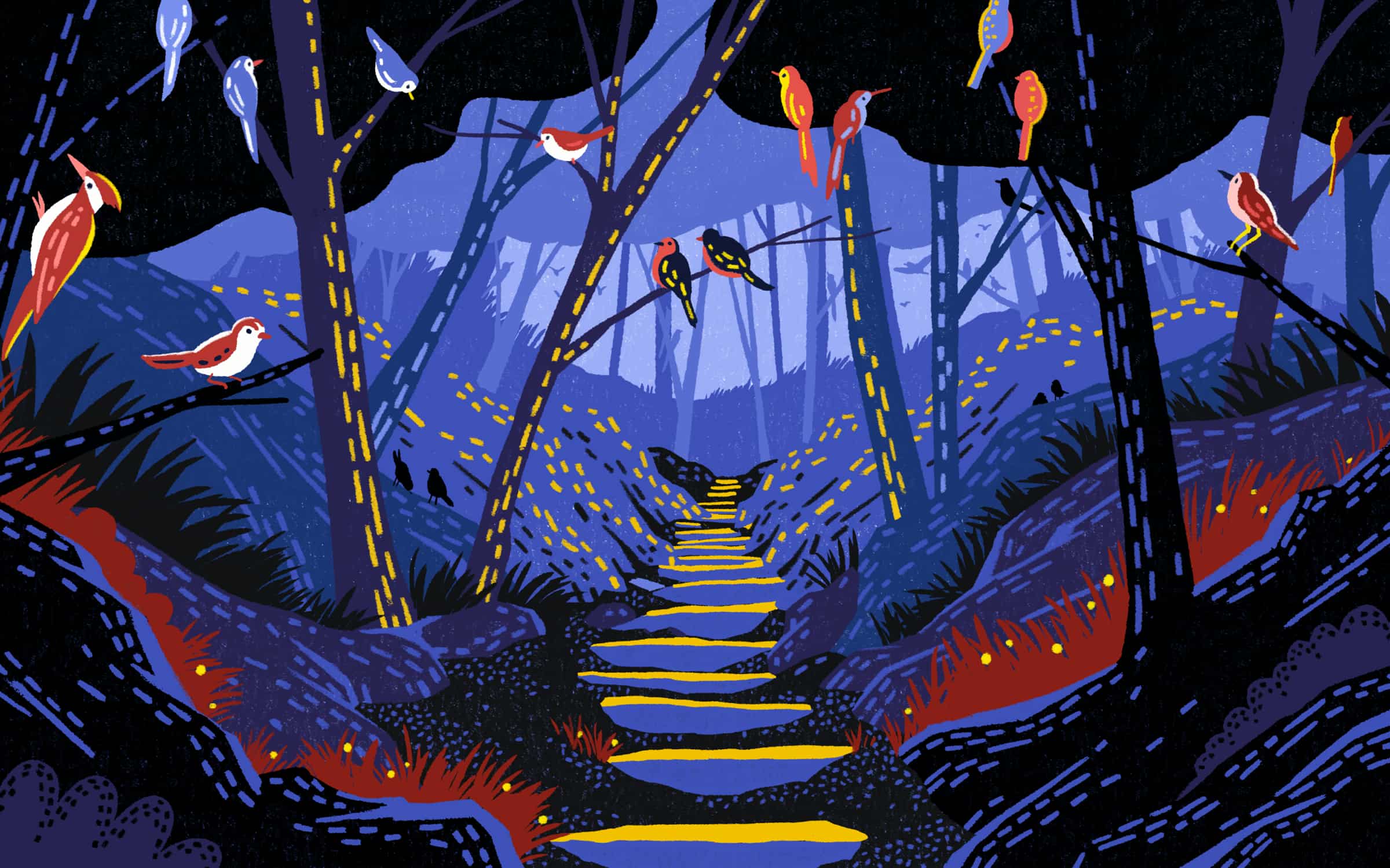
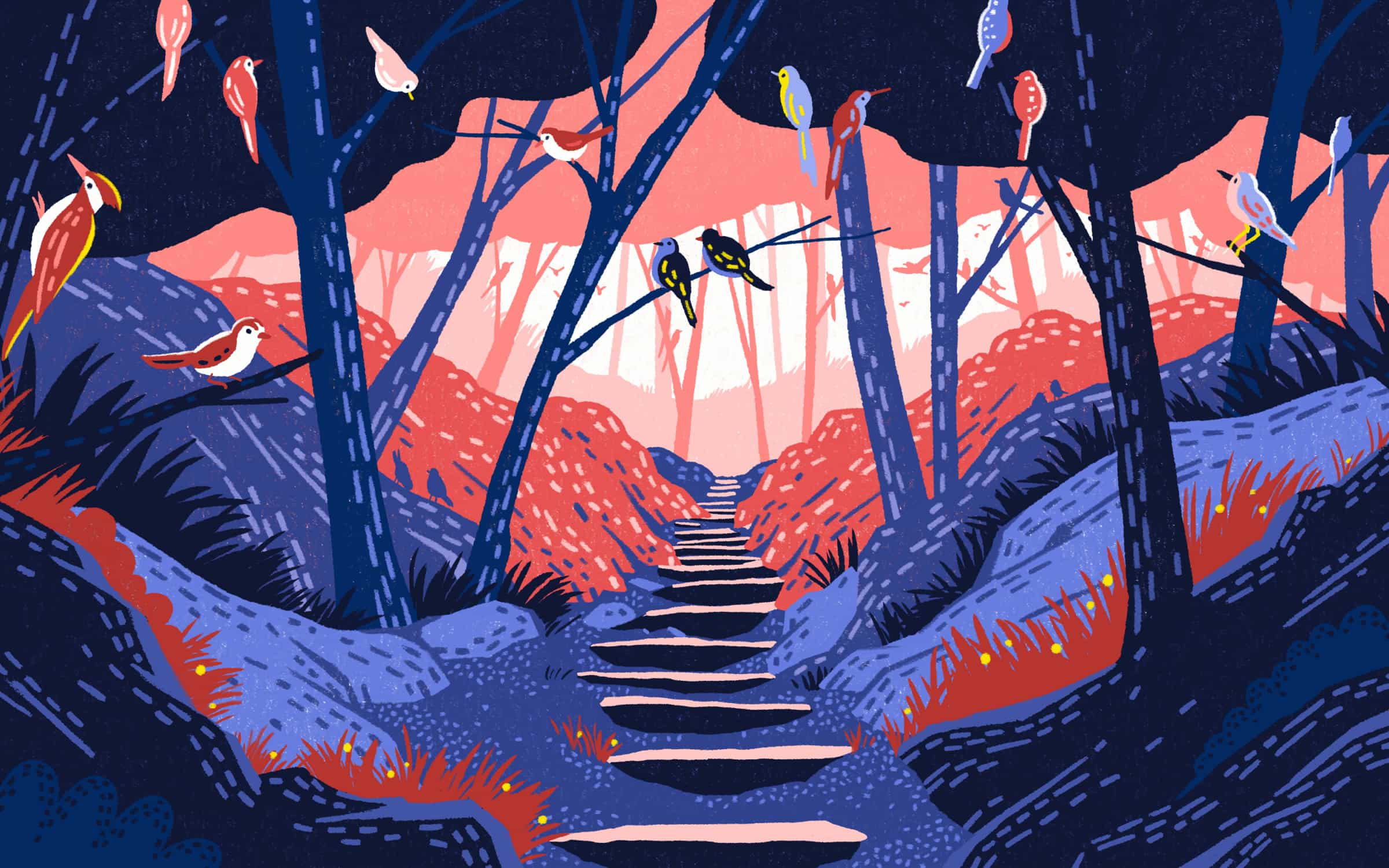

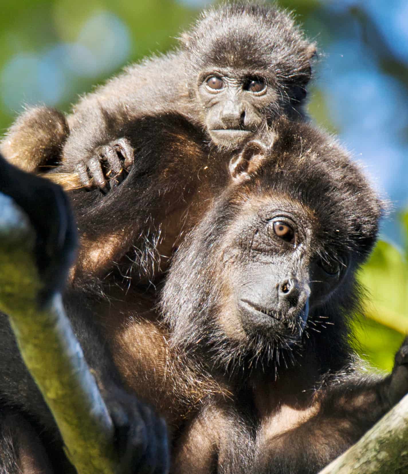
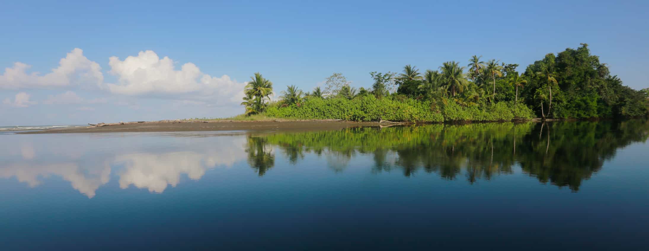
Adaptive illustration commissioned to adjust and match the different colour palettes. Occasional integration of photographic elements into the illustration helped enhance the authenticity of the fantastic world, creating a beautiful experience
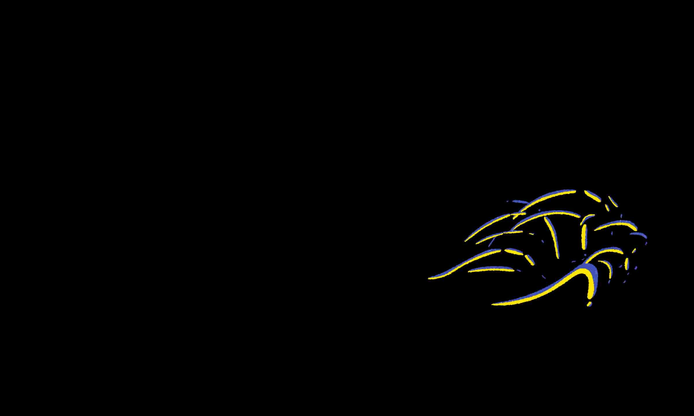
We chose to play animation on a solid background — which can vary depending on colour-palette choice. The animations are beautiful in this isolated format, and it helps create a clear focal point. This way, readers know exactly where the action is taking place and take in subtle details
News and information should be accessible to everyone. So @googleUK, @Guardian and @RNIB partnered to develop Auditorial, an experiment in storytelling for blind and low-vision people that adapts to suit your needs #GAAD
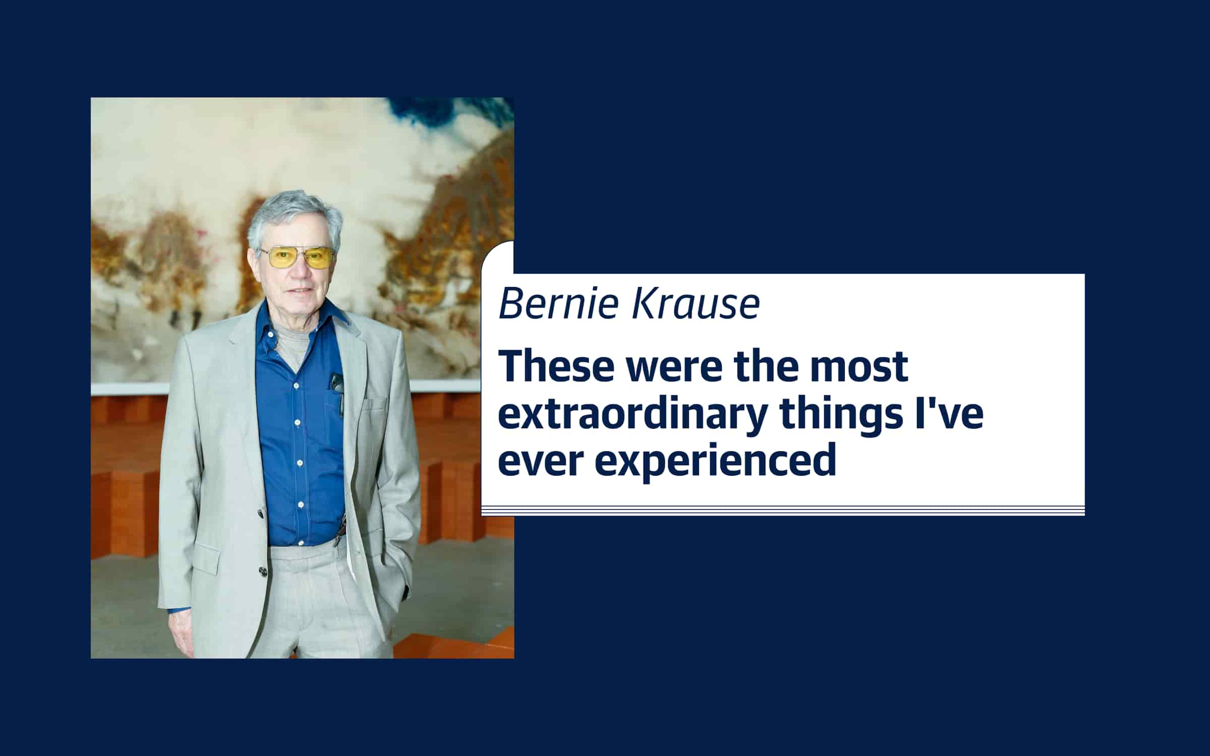
Auditorial, a new idea for accessible storytelling

Proud to work with @RNIB & @Guardian on a storytelling experiment designed to adapt to blind & low vision readers. It's customizable so that those with visual disabilities can have an experience that is as comfortable and rich as any other reader
The project was considered highly successful by the Guardian and our partners at Google and the RNIB. It achieved significant press coverage, sparked renovated energy around accessibility initiatives, and helped us grow as better creatives
“This was easier to access than anything on a traditional news website or app. This actually gave me control over my experience”
User feedback
“This is something really really special”
User feedback
“This will be a game changer for visually impaired people”
User feedback (tester)
“I wish I could have these controls on every website across the web”
User feedback
“I got so much more information than reading through a regular news article, where usually I can't tell what the images or content are in the way that the writer of the article intended”
User feedback
And most importantly, we received great feedback from our users